June 30, 2009
June 28, 2009
June 27, 2009
Anant Raje, Architect India
June 26, 2009
June 25, 2009
June 24, 2009
June 23, 2009
June 22, 2009
The Material City
by Jane Margolies

How the Bloomberg Administration's push for design is changing the face of New York.
A Conversation with First Deputy Mayor Patricia E. Harris.
------
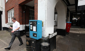
ON A RECENT DAY IN New York, the city’s Design Commission, which approves works of art and architecture planned for the public domain, was up in its City Hall aerie, scrutinizing a new base for sidewalk newsstands. A block away, the Department of City Planning was finishing a proposal to rezone the Bronx civic center. Over at the Department of Transportation, daring plans were underway to shut down seven blocks of Broadway to traffic, turning it into a pedestrian plaza. And from its HQ in a converted gum factory in Long Island City, the Department of Design and Construction (DDC) was signing on world-class architects for its firehouses and police stations.
Welcome to the design-minded world of the Michael R. Bloomberg Administration. In office since 2001 and now angling for a third term, Mayor Bloomberg has had his share of critics. But most urban observers agree that no administration in recent memory has focused on design to such an extent. Overseeing this flood of innovation is First Deputy Mayor Patricia E. Harris, who worked for Bloomberg’s news-service company before his election and who earlier in her career served as executive director of the Art Commission, recently renamed the Design Commission. These days, she sits next to her boss in the bullpen that is the Mayor’s Office. (Upon election, Bloomberg ripped out partitions in City Hall, creating an open workplace reminiscent of a newsroom.) As New York’s second most powerful public official, Harris guides commissioners, articulates the mayor’s vision to his staff, and helps steer the five boroughs toward a better-designed future. She spoke with I.D. about the Bloomberg approach and how she got hooked on design.

Certain city agencies, like the Department of City Planning, have always had a hand in design. But during Bloomberg’s term in office, interesting design has come from surprising places—the Health Department, for instance, promoted condom wrappers and dispensers by Yves Béhar. How has the administration managed to encourage good design in all branches of government?
It starts with Mayor Bloomberg. The mayor strengthened the role of [DDC commissioner] David Burney and his agency, and he has appointed a number of commissioners who are interested in design—a transportation commissioner who is passionate about it, a city planning commissioner who cares about the way things are built.
Last year, the Art Commission—which was formed in 1898—was renamed the Design Commission. Why the change?
The word “art” never fully reflected all of the agency’s responsibilities. Art is still an important part of that office—we just raised private money to restore all the portraits in City Hall—but “design” better describes the mandate. There are many landscape and construction projects that come under review, and we currently have probably the strongest Commission we’ve ever seen: the architect Jim Polshek, landscape architect Signe Nielsen, Guy Nordenson—finally, an engineer on the commission! We’re very lucky.
Where does your own interest in design come from?
I’m a New Yorker, and I care about the built environment. But being the director of the Art Commission for seven years made me look at the design of everything from streetlights to garbage receptacles with interest. When I was at the Art Commission, we organized an exhibition on street furniture from the early 20th century. We had drawings for a drinking fountain for horses from 1908, but we didn’t know where the fountain was. We tracked it down at the Vetport at JFK, and had it out in front of City Hall during the exhibition. We then decided to place it in Central Park for use by the hansom cabs—it’s near the entrance on 59th Street near Seventh Avenue. The other day I was driving through the park and I was so excited to see that fountain. Once you get into design, it becomes part of your life and never goes away.

What effort are you proudest of?
I was very excited to be a part of the relocation of the City Clerk’s office, which is where the Marriage Bureau is. The City Clerk’s office used to be in the Municipal Building, and people had to stand on several lines and interact with several different people behind several different imposing windows. Now we have a new, larger space on Worth Street, and you can take care of everything with one clerk, in one place, without standing on any lines. There’s a mural of City Hall that you can have your picture taken in front of and a City Store, where you can get everything you need for your wedding ceremony—in case, say, you forgot your camera. The two chapels have artwork on loan from the Brooklyn Museum, and—perhaps most important to brides—the restrooms have full-length mirrors so people can actually see how they look. It’s creative and a much more efficient way to do business with the city.
Ten new bike-rack designs were recently tested, and one of them was chosen as the official bike rack of the City of New York. Over the next three years, nearly 5,000 of them will be installed around the city. Can you talk about that initiative?
I sat on a panel evaluating the designs. Here is this repetitive piece of street furniture, and we wanted to make sure it was the best, the most interesting, the most functional. The DOT and the Cooper-Hewitt, National Design Museum sponsored the competition, and there were more than 200 entries. The jury selected 10 designers and provided each with $5,000 to develop prototypes. The racks were installed at Astor Place so that people could use them and offer comments on the competition website. The jury unanimously selected a clever galvanized-metal design that’s evocative of a bicycle wheel, by Ian Mahaffy and Maarten De Greeve of Bettlelab in Copenhagen. The whole process took a little extra time, but the idea is to go beyond business as usual and bring design quality and innovation to the work of city agencies. There’s no reason New York City can’t put the best face on what we build.


The administration has done much to support development: freeing up land, offering tax breaks to encourage companies to build, investing in infrastructure where development will take place, expediting permits. How do you balance go-go development with the need for good design and preservation?
I don’t think there’s a tradeoff between the two. One encouraging project is the Bank of America building in Midtown. It’s LEED-certified, and it shows that aggressive development can also mean good design. The High Line—a remnant of an elevated Depression-era railway that’s being turned into a park—is a great example of adaptive reuse. And despite the pace of development throughout the city, there have been a record number of designations by the Landmarks Preservation Commission: 2,362 buildings in 18 historic districts, 132 individual landmarks, and 9 new historic districts outside Manhattan—the highest number of districts in boroughs other than Manhattan designated by any administration since the Commission was formed in 1965.

The DDC is responsible for getting city structures designed and built. Under Bloomberg, the rules governing the hiring of architects to design these projects have been completely rewritten. Now, under the Design + Construction Excellence (D+CE) program, prominent architects have become part of a pool who agree to work for a percentage fee and to whom the city can turn for its civic buildings. How did this program come about?
In the past, the city accepted proposals from architects and designers and then scored them using the fee as a major selection criteria. We started a pilot project where we asked designers for proposals and selected the top technically qualified one from the competition. We then asked that firm, “Can you do what you proposed within this budget?” If they could, they were hired. As a result of this program, we’ve interested really important firms in doing work for the city: Skidmore, Owings and Merrill designed a 911 call center; Grimshaw Architects [with Ammann & Whitney], the Queens Museum of Art; 1100 Architect, the Queens Central Library; and Rafael Viñoly, the Brooklyn Children’s Museum and the 121st Street Police Precinct. We’re getting really interesting work.
Have you encountered resistance to these modern designs by some of their tradition-bound constituents—the police department, for example?
Not at all. They deserve the best, most interesting building we can give them. The agency involved in the project explains what they need to do their work—there’s a committee that meets with the architects—so they are involved in the design process.
Under the DDC’s new program, the proportion of the building budget that goes to design has gone up. How do you make the case that spending extra money on design is worth it?
If design costs have gone up, construction costs might go down. If a building is designed well, there are fewer change orders, or maybe you don’t have to replace parts of the building so soon. The building might work more efficiently—a more expensive HVAC system might mean that the building is more energy-efficient and will cost the city less in the long run. You can design something simply and efficiently and it could in fact be less expensive than something not as functional and not as attractive.
What projects are in the works?
One really creative and practical design is the Bronx River House, a green structure by Brooklyn-based architects Kiss + Cathcart that will be home to the Bronx River Alliance. There will be a nature classroom and a multipurpose room for the community and local schools to use. A screen of galvanized steel and mesh will wrap the entire building, creating a surface for vines to grow on. Rain collected on the roof will water the vines, cooling the building. Another project is the 121st Street Police Precinct building by Viñoly. It’s the first new precinct headquarters on Staten Island in decades, and it’s LEED certified. I don’t know if I ever thought of Rafael Viñoly designing a police precinct, but the city is lucky he has.
Mayor Bloomberg has decided to run for a third term. What design goals would you hope to realize in the next four years?
I’d like to see the D+CE program become the standard for the city and to no longer be called “an initiative.” A lot of projects are in design or under construction, and it will be great to see them executed. One is a new Mariner’s Harbor branch of the Public Library, on Staten Island. This community was known for its oyster industry in the late 19th century, so [local architects] Pagnamenta Torriani based the library’s design on an oyster shell, with two scalloped parts open to one another. I’m also looking forward to Kiss + Cathcart’s building for Bushwick Inlet Park, part of the Greenpoint and Williamsburg waterfront development. The structure will function as the Parks Department’s district headquarters, a community space, and a comfort station for the park. But what I love most about the innovative design is the sloped green roof, which will be fully accessible to the public and will itself be a park. Both projects will be winning awards from the Design Commission this year.
Given the downturn in the economy, might good design in the coming years be regarded as a luxury, rather than a necessity?
There’s a school of thought that says you can’t have good design because it costs more. That’s not the view of our administration. It’s a common misconception that good design is only for those with big budgets, but architects will attest that part of their skill is to get the most from a budget, even a modest one. The tighter the budget, the more important design ingenuity becomes. In the current economic situation, there will probably be fewer capital funds available, but there are great opportunities as well. Construction bid prices have fallen significantly. There may be more people with interesting talents willing to work for the city.
Jane Margolies is a New York–based writer and editor. She has a master’s degree in urban planning and worked in the Mayor’s Office under David N. Dinkins.
Photography by IAN ALLEN
(Source: I.D. Magazine)
June 21, 2009
City as Frame

Daniel Birnbaum, the curator of the 53rd Venice Biennale, took its title — “Making Worlds” — from the American philosopher Nelson Goodman, who proposed replacing the slippery question “What is art?” with the question “When is art?” During the biennale, still arguably the world’s most important international exhibition, the answer is: always, constantly, art without interval. And Venice itself — that “repository of consolations,” as Henry James called it — becomes the glorious frame. RANDY KENNEDY
June 20, 2009
RIBA Lubetkin Prize Shortlist Announced
RIBA Lubetkin Prize Shortlist includes the 'usual suspects' along with a few others. It is unfortunate that even at the time of such grave global crises, such reputable prizes are awarded to works that perpetuate singular/signature 'objects' and the culture of excess.
Ali Akbar Khan, Sarod Virtuoso of Depth and Intensity, Is Dead at 87
On a sad note, Music has lost one of its best....
Fritjof Capra described his music as 'cosmic sound' - fathoming the deep depths of the seas and souls..... J Krishnamurti called it 'pure sound of silence'. His music was not only audible sound... it laid out the undecipherable abstraction into a legible landscape.
The best tribute to music is offered by the German poet Rilke; I offer the same to Ali Akbar Khan and his music:
Music: breathing of statues. Perhaps:
silence of paintings. You language where all language
ends. You time
standing vertically on the motion of mortal hearts.
Feelings for whom? O you the transformation
of feelings into what? --: into audible landscape.
You stranger: music. You heart-space
grown out of us. The deepest space in us,
which, rising above us, forces its way out,--
holy departure:
when the innermost point in us stands
outside, as the most practiced distance, as the other
side of the air:
pure,
boundless,
no longer habitable.
(Rainer Maria Rilke)
June 19, 2009
June 18, 2009
June 17, 2009
India's Messy Urbanism | Viren Brahmbhatt

Like other megacities, the large cities of India are grappling with the conflicting logic of globalization and localization. As new networks of global trade and finance create new opportunities, developer-friendly architecture and planning are appropriating contemporary discourses, and producing urban forms hitherto unknown. Globalization and its influence are thus transforming the city as physical, social, and cultural boundaries are being renegotiated.
On the one hand, India’s booming economy has fueled a euphoric decade of development, embraced by a new generation of architects bent on transforming the traditional dynamics of practice. At the same time, the nation is plagued by a one-size-fits-all architecture created by globetrotting architects and multinational players who are more focused on singular objects and signature buildings. A land of dazzling opportunities and paradoxes; a paradise of manufactured faux cities for the nouveaux riches and a hell for slumdogs: such is the predicament of India.
These thoughts came to mind at the recent conference Emerging Exchanges: New Architectures of India, held at Parsons the New School for Design in New York, and organized jointly by the New School, the India China Institute, and the Architectural League. Unfortunately, the two-day event’s agenda of “exchanges” hardly seemed to touch the complex challenges of contemporary practice in India and was a lost opportunity to engender real dialogue. Not only did this event highlight the major disconnect between academia and architecture, it signaled a cultural blind spot that spells nothing short of hopelessness for millions of sprawl- and slum-dwellers written off by western architects and planners.
With the possible exception of China, no nation other than India stands at such a crossroads in terms of development, diversity, and social divisions. The huge buzz about the country’s economic growth is manifest in the malls, retail complexes, multiplexes, and luxury residential towers sprouting up across the nation, their glass-and-metal facades emblematic of the New India.
Far from taking place under the government radar, this growth has been sanctioned by India’s planning authorities. As long as a plan is produced for bureaucratic formality, officials are more than happy to approve haphazard, large-scale schemes that have no long-term strategies or detailed analyses of their impact. Virtually no consideration is given to the environmental consequences, local economies, or the social and cultural fabric of communities. Displacement through dispersal—of agricultural land, people, businesses, and slum dwellers—is consequently rampant.
Global consumerism has also driven the huge desire of up-and-coming cities to ape the likes of London and Dubai, hence the parade of international-style projects symptomatic of our time, dropped into completely different cultural and social contexts in emerging economies. These desires are fanned by the bureaucrats and urban elites who opt for a “global” architectural language to shape and narrate their national ambition, without regard for local culture and politics.
We’ve seen all this before, notably in China, where cities like Beijing and Shenzhen failed to capitalize on their reinvention as opportunities to define a sustainable model for urbanization. Mumbai and other fast-growing urban centers have taken misguided cues from these artificial cities, effectively conceived as large-scale architecture, producing nothing but postcard urbanism. In such places elite architects create their iconic buildings, while large international firms busily reproduce the old in new attire. Such urban-design and planning strategies, already failed elsewhere, are constantly being reemployed, never more swiftly than with today’s Photoshop urbanism, where renderings are swapped in and out with total disregard for regional concerns.
The current predicament is an opportunity to slow down and rethink our strategies. The architectural profession needs to reposition itself toward engagement, rather than merely export the largely western, 20th-century models and values that have created more of the same everywhere. Economists, sociologists, cultural critics, and others have long recognized the perils of globalization. We would do well to draw upon this body of thought to consider what role, if any, architecture and urban design may play in defining a new kind of urbanism for the 21st century—one that is both socio-economically and environmentally sustainable. If we do not think about rapid urbanization now in light of the global risks of population growth, poverty, and climate crisis, we will face its irreversible aftermath in the immediate future. This is a crisis we can certainly avoid.
Historically, architecture has been at the core of cultural production, and has played a pivotal role in defining cultural space and physical form. However, under globalization, the question of “culture” hangs in the balance: While the flattening of cultural geographies and “globalism” are pushing toward more homogenized world culture, the profession is busy building symbols of global capital in response, instead of investigating architecture as an urban construct—which it inevitably is.
India provides an excellent case study for investigating the city of the coming century, as the largest democracy on earth negotiates urbanization and economic development on a staggering scale. Contemporary architectural practice should focus on the context of regional and national perspectives, as well as local practices. A true global exchange is where international architects and their counterparts in India can learn from each other to find better local solutions to global challenges, and advocate for high standards for the built environment in conjunction with intelligent city governance and management structures.
Our top priorities should include employing appropriate technologies and construction practices to engage the large available skilled and unskilled labor force in India; and devising architecture as infrastructure that integrates and addresses the scarcity of resources, climate change, and other escalating pressures to produce environmentally sustainable architecture and more livable urban environments. The condition of production prompted by transnational exchanges—along with architecture that responds to global consumerism—is not necessarily a bad thing. Nor should it automatically produce insensitive projects. As long as there is some degree of self-assessment, along with a willingness to engage with local vernacular practices and amplify the latent qualities of particular locales, engagement and partnerships could engender more inclusive approaches toward an open-ended architecture capable of sensible change and growth.
The truth is that fantastic challenges lay ahead. Cities like Mumbai, Hyderabad, Bangalore, Pune, Ahmadabad, Kolkata, Surat, and Delhi are some of the most exciting places to design on the planet, because they are at once loved and loathed, messy and modern, chaotic and lyrical, rich and poor, old and new, vigorous and corrupt. Above all, they are naively energetic in their insatiable hunger for growth.
Unlike western cities, Indian cities are rural in spirit, shaped by the slow linking of towns and villages. They have retained their rural character, as well as overlapping hierarchies of public and private spaces where distinctions are easily blurred, and “contamination” an accepted norm generating, altering, and constantly modifying the urban landscape, creating transitory urbanism with not-so-clearly defined boundaries. Every space is a contested territory, ephemeral yet rooted, and perpetually dynamic. In many instances, contamination and messy urbanism of the “informal” are traits closely related to poverty, a lack of resources, and the need for sustenance that have translated into historic patterns stigmatizing Indian cities.
Today’s global economic slowdown may be a blessing in disguise for India, allowing the nation to take stock of its growth in a more sustainable manner. In this context we must reengage design practices that result from a genuine exchange between the local and the global. The promise of such cultural dialogue has animated the fields of sociology, linguistics, and cultural history, and there’s no reason why architecture can’t also contribute to creative, engaging, and inclusive international dialogue. Divergent multiplicities rather than assumed uniformity in architecture and design should be the focus.
It would be a missed opportunity if we use this situation as merely new fertile ground for the urban elite—including the self-indulgent prophets and self-fulfilling architectural prophecies that pass for high design these days. I am wearier of the global elite than of the slumdog, and look forward to the exchanges yet to come.
Viren Brahmbhatt is a New York-based architect and urban designer. He teaches at the Pratt Institute School of Architecture, and is the author of the forthcoming book Architecture of Disjuncture.
Faces of the favelas

The French artist JR first made his mark in Rio de Janeiro last year, as giant posters of staring eyes started appearing on buildings in the city's oldest favela.
He was drawn there following the controversial deaths of three young men, amid alleged collusion between Brazilian soldiers and a drugs gang.
But now JR's work has made it on to some of Rio's grander structures. Take a tour of the city with the artist himself, and meet the people who inspired him.
Photography by Helen Clegg and courtesy JR, AFP and Getty Images.
Slideshow production: Helen Clegg and Paul Kerley. Publication date 17 June 2009."
June 16, 2009
June 15, 2009
Kindle Joins a Bookstore Ritual - Authors Can Sign It
 | |
| David Sedaris signed a Kindle. |


![[AIdomesticviolence.jpg]](https://blogger.googleusercontent.com/img/b/R29vZ2xl/AVvXsEhWkasnTZrxMJuThTAcxUVvyFIE91FUm1ykPFMjudFIjL9_tEXi1AZvgLo34CLbu0GA6kJJgCa_VVQVF4hSLnMVEouL9qU1I7IGyGWYZHhFgxx5-UWSHnEblN36pC5azv_lEhWv/s1600/AIdomesticviolence.jpg)


