

Constructed Thoughts: Built | Unbuilt
August 31, 2009
August 30, 2009
Branding New York: New NYC Logo | Viren Brahmbhatt
Does the new NYC logo by Wolf Olins define a new “low” in logo/identity design? It was bewildering enough to see it replace the original - unassuming, and ridiculously simple stenciled letters on NYC Taxi with (NEW), stalky, chunky, clunky and crude letters NYC accompanying the hideously encircled T. The original simplicity and crudeness was more acceptable than this pretentious “design-ed” identity that New York City hardly needs. But now the City has decided to replace individual logos for each New York City Agency that proudly adorned their websites, letterheads and such. Now the City has started changing those previous logos and will incorporate the new NYC logo as a prefix to their agency names. So here is in response to this self-induced identity crisis that I offer this lament.
The NYC logo on New York City Taxi
New York City identity, the NYC logo was designed by Wolf Olins for the city’s tourism and marketing body NYC & Company, the result of a blending of three organizations (NYC & Company, NYC Big Events and NYC Marketing). Then in 2008, it was clumsily applied to NYC Taxis without any thought or consideration for how it might add rather than integrate city’s visual clutter.
New York City identity, the NYC logo was designed by Wolf Olins for the city’s tourism and marketing body NYC & Company, the result of a blending of three organizations (NYC & Company, NYC Big Events and NYC Marketing). Then in 2008, it was clumsily applied to NYC Taxis without any thought or consideration for how it might add rather than integrate city’s visual clutter.
Under the auspices of the Mayor’s office, the new NYC logo is to be adopted and used by all New York City agencies. Cities need identity, as branding is part of how cities sell themselves to the world; but they also leave their mark on people’s lives and city’s visual landscape. It is always a contentious issue however, as to what might constitute or represent a city’s identity. It gets even harder when it is about branding New York City, which by all comparisons is a tall order. For a city like New York that claims a unique status in the nation and the world as a global city, its identity as a place of diversity and a logo that represents it cannot afford to be divisive… Furthermore, the challenge is a tough one in face of highly opinionated New Yorkers…

New York is a divided city, in more ways than one. However, the apparent divisions are what provide the city its identity. How does one reflect that visually and typographically in a logo or symbol? How could it be achieved? The lived-through and tried symbols have come about without much pretense. Take for example the NY symbol of the Yankees, or the simple graphics of I Love New York campaign… or the Helvetica-laden urban signs of the MTA that practically invade our underground typographic landscape; the street signs and the traffic signals… NYC Sewer manhole covers that dot the streetscape of New York, or the painted brick facades of brownstones… leftover newspaper dispensers and such.
Below are some of the past and present logos of New York City agencies/departments that give them their unique identity based on their individual missions. They signify uniqueness of branding New York in terms of city’s diversity. It is in this context that the NYC’s logo may need to be viewed and evaluated.

 Copyright © 2009 Viren Brahmbhatt
 August 29, 2009
Chapel, Ronchamp by Le Corbusier (AR - 1956)-
On the anniversary of his death, AR+ revisits a review of Le Corbusier’s chapel at Ronchamp, from an article in the March 1956 edition by James Stirling.


August 27, 2009

August 26, 2009

August 23, 2009

August 22, 2009

August 21, 2009
Book Covers: Company | Samuel Beckett

Samuel Beckett, complete works, 2009
Faber & Faber, London
Cover design & bespoke typefaces
For she shook off your little hand and made you a cutting retort you have never forgotten.
The voice comes to him now from one quarter and now from another
. . . Thus for example clear from above his upturned face, You first
saw the light at Easter and now. Then a murmur in his ear, You are
on your back in the dark.
And whose voice asking this? Who asks, Whose voice asking this?
And answers, His soever who devises it all. In the same dark as his
creature or in another. For company.
is a necessary complement.
Were your eyes to open they would first see far below in the last
rays the skirt of your greatcoat . . . till it vanishes . . . Vanishes from
Being has a form. Someone will find it someday. Perhaps I won’t
but someone will. It is a form that has been abandoned, left behind,
From:
‘Company’
by Samuel Beckett


August 20, 2009

August 17, 2009
Words without borders
Once I wake up, I start dreaming.......
and thinking and dreaming and then thinking again.... Don't know which is which... or which is witch... or witch is which....
Facetiously vagabonding or waggishly committing to wit as an escape from the routines of the rut or the rut of the routine.... But then,
I finally do wake up and start dreaming..... and thinking and dreaming all over again... Just don't know which is which and don't care..... As long as I can go on dreaming..... thinking that I am dreaming even in my wakeful state... because in my mind... waking up is synonymous with dreaming and thinking is synonymous with
dreaming.......
Facetious:
- Main Entry: fa·ce·tious
- Pronunciation: \fə-ˈsē-shəs\
- Function: adjective
- Etymology: Middle French facetieux, from facetie jest, from Latin facetia
- Date: 1599
1 : joking or jesting often inappropriately : waggish
2 : meant to be humorous or funny : not serious facetious remark>
August 15, 2009

August 13, 2009


August 12, 2009

Visual Books | The Art of Harvey Kurtzman: The Mad Genius of Comics

Article By STEVEN HELLER, Published: August 6, 2009
August 11, 2009
Now Showing | ‘Sensate: Bodies and Design’
 Photos courtesy of San Francisco Museum of Modern Art
 “P_Wall,” by Andrew Kudless, now at the San Francisco Museum of Modern Art.
Source: The Moment Blog - NYTimes.com
“Sensate: Bodies and Design,” an exhibition that runs through Nov. 8 at the San Francisco Museum of Modern Art, takes a contemporary look at the way the human body figures in architecture and design. Far from using the idealized human form as inspiration, the works in “Sensate” (organized by the museum’s curator of architecture and design, Henry Urbach, with pieces from the museum’s collection and two commissioned installations) refer to the nitty-gritty aspects of the body. Go to the article....
August 10, 2009
In pictures: MirrorFootball.co.uk posters
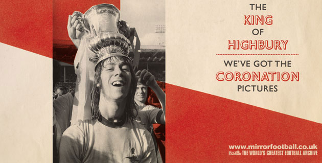
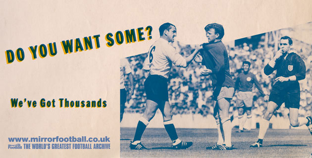
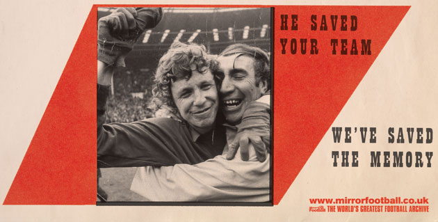
Billboards of classic sporting moments that will be posted near 10 big football clubs to launch the Mirror football website. The clubs include Tottenham Hotspur, Aston Villa, Newcastle United, West Ham, Manchester United, Portsmouth and Manchester City
Source: guardian.co.uk
August 3, 2009


Subscribe to:
Posts (Atom)